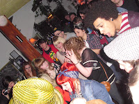
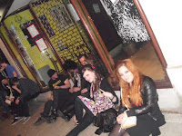
Blah, all the usual niceties. This post is late because frankly I’m still feeling awful from the weekend. I've lost my voice! Which as you can imagine is like my own personal hell. But before you start JUDGING me, it was all for a good cause, as of course! this weekend past was that of the eagerly awaited second Illustration Fundraiser at Hamptons- and it was a cracker! Everybody had a splendid old time, DJ Derek was bangin’ out the tunes and after expenses it made £305!! We’re now up to around £1225 which is awesome.
...but we’ve still got a long way to go. Our target for both shows is around £3000 so we’re not even halfway. I’m planning to be hosting one more in a couple of months but seen as my events have raised over £700 of our current total I think it’s about time somebody else jumped on the ‘fun-raising’ wagon, else we just won't make it. Also, despite the venue almost reaching capacity at one point, the turn out of illustration folks could have been a lot better. After Easter break I’ll arrange a meeting to see who’s getting on it. Anyway, bitching aside, it was bloody terrific! Here’s some visuals for yeh. (All presented in an impractical straight line 'cause when I try put them in a line across it turns all my text in to a link!! ...WHY WOULD I WANT THAT TO HAPPEN!?)
...but we’ve still got a long way to go. Our target for both shows is around £3000 so we’re not even halfway. I’m planning to be hosting one more in a couple of months but seen as my events have raised over £700 of our current total I think it’s about time somebody else jumped on the ‘fun-raising’ wagon, else we just won't make it. Also, despite the venue almost reaching capacity at one point, the turn out of illustration folks could have been a lot better. After Easter break I’ll arrange a meeting to see who’s getting on it. Anyway, bitching aside, it was bloody terrific! Here’s some visuals for yeh. (All presented in an impractical straight line 'cause when I try put them in a line across it turns all my text in to a link!! ...WHY WOULD I WANT THAT TO HAPPEN!?)

I’ll have to back track a bit now, got all ahead of myself with the excitement! On the Monday of last week I had a work in progress with Pete, which went well. Although he did warn us that this is the time when people tend to freak out, which when I look at my time-plan, I am very much on the brink of doing. He also expressed that he favours the half tone over pencil, that also being the unanimous feeling. I was given even more ideas of how I could do it though, involving block colour and half tone but in a different way, so I have some more approaches to try out. I’m also looking in to a more effective way of using half tone, like a brush on Photoshop perhaps. On Tuesday we had a London trip, which was jolly good. Apart from I had to sit in front of this guy on the coach.

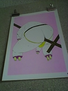
We first got taken to Salisbury House where we went to the Pick me up Exhibition. There was loads gong on and it was really inspiring. I saw some really cool examples of half tone in use, which was encouraging, although I remain daunted by the execution. The first image is of a book called 'Ada' by
Gertrude Stein. (Stein, 2010) It's not really my thing (silly or disgusting aswell as visually exciting) so I didn't pick up a copy but I did admire the technique and use of colour.
Gertrude Stein. (Stein, 2010) It's not really my thing (silly or disgusting aswell as visually exciting) so I didn't pick up a copy but I did admire the technique and use of colour.

I also saw some work I reeeeeally like by an artist I’d somehow not been acquainted with before! James Unsworth’s work is seriously fucking disgusting. Hence why I enjoy it. He had some prints and a book for sale there, 'Ninja Turtle Sex Museum' (Unsworth, 2010) that was very unfortunately sold out! But I shall make sure I get my grubby mits on it if I can! Also, his website (that I’ve linked above) although extremely simple, I really like. Anyway, the book is a basically just a load of really cool drawings of really gross stuff, the main themes being sex and teenage mutant ninja turtles, and ya can’t argue with that.

There's a print shop below the gallery we’re having our degree show in on Brick Lane, and they were there doing live prints there which was cool. There were artists downstairs doing live illustrations and selling them and there was a room where you could make stuff yourself. There were also a couple of instillations where a show was going to be acted out, and one that involved audience participation, which was interesting. It was nice to visit a creative space that was so interactive. Here’s some pictures of some of that.
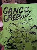
Those green ones at the end are pictures from another book wot I liked. Anyway, after that some of us took a trip to Brick Lane for bagels, and so that the others could check out the gallery space I booked us. There was an exhibition on at the time and I think it was really good to see the space in use to give us some inspiration and to see how much is possible. The show title was strung up in the window, there were large 3D objects and music playing. I think we may need some boards across the middle of the space in order to fit all our work in though. This is the only picture I got on my crappy mobile that isn’t totally fuzzy but here’s Pierce’s head and the gallery… but mainly Pierce’s head.

Our last port of call was Atlantis Art, which was brill. It was huge and cheap. The Bristol board was a whole £2 cheaper than Southamptons one art shop! Stoopid Perrys!! The portfolios were also a lot cheaper than at Cowling and Wilcox AND they had zips and handles! I could have got one of the same size as mine for a bit less, that would be easier to carry and also rainproof! But I suppose mine does look nicer... and it’s brown. Yeaaah… That’s what it’s all about. Oh, and here’s a nice bit of graff we saw too.
I was also hoping to go to this museum in Holborn, which is meant to be like somebodys house- and he has a load of human remains there? It sounds creepy anyway. I know where it is now though so I’ll check that out another time.
Friday I finally finished my screen print! My acetates had stuck together and some of the ink had gone from one to the other but it wasn’t that bad and I quite like imperfections so I persisted. Jonny helped me re-learn the practice and I really enjoyed it! I’m generally quite haphazard and spontaneous with my approach and don’t know if it really suits me as a process but it’s definitely something I regret not having another razz at before now. It’s nice to hand make a series of images in that way, which although are the same image all vary to an extent, and they just seem a bit special as a piece of work because of the process. And they feel nice. Not that you should really be all touching ‘em and stuff …Get ‘em all grubby.

Anyway, I made and labelled 27 all together and a few of them I did on pink and black paper to see how they turned out. I also offset a few slightly and as I used fluorescent green with magenta pink they have an almost 3D look to them. I’m pleased with them and chose the best to go at the end of my portfolio. I thiiiink I may have sold one at the show too. That or my counting is appalling (which it is) so I’m not holding my breath or anything.
Also this week I have amended my cover image and I think it looks a lot better. I think the problem was the proportions, and I’ll be adding the smoke afterwards.
I’ve also finished that Webcomic I was talking about ages ago so that’s a weight off. What was I thinking taking that on as well as all the fundraising and London show business!? It’s certainly not my finest work but here it is if ya fancy a peek. It's about bullying it is.
Anyway, I’m hungry so I’m going to see what I can slap together out of whatever lies rotting in my cupboards. Next week we have our identity workshop during which we will be finalizing our wall for the catalogue image, so I’ll be preparing something for that in the week. Other than that the focus is solely on the FMP, perhaps taking some time to polish some portfolio bound images too.
Thanks for stopping by…
Quim out


No comments:
Post a Comment