Monday 28 March 2011

17. We Sure 'Raised Some Fun!'

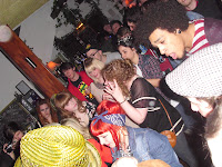
Blah, all the usual niceties. This post is late because frankly I’m still feeling awful from the weekend. I've lost my voice! Which as you can imagine is like my own personal hell. But before you start JUDGING me, it was all for a good cause, as of course! this weekend past was that of the eagerly awaited second Illustration Fundraiser at Hamptons- and it was a cracker! Everybody had a splendid old time, DJ Derek was bangin’ out the tunes and after expenses it made £305!! We’re now up to around £1225 which is awesome.
...but we’ve still got a long way to go. Our target for both shows is around £3000 so we’re not even halfway. I’m planning to be hosting one more in a couple of months but seen as my events have raised over £700 of our current total I think it’s about time somebody else jumped on the ‘fun-raising’ wagon, else we just won't make it. Also, despite the venue almost reaching capacity at one point, the turn out of illustration folks could have been a lot better. After Easter break I’ll arrange a meeting to see who’s getting on it. Anyway, bitching aside, it was bloody terrific! Here’s some visuals for yeh. (All presented in an impractical straight line 'cause when I try put them in a line across it turns all my text in to a link!! ...WHY WOULD I WANT THAT TO HAPPEN!?)


I’ll have to back track a bit now, got all ahead of myself with the excitement! On the Monday of last week I had a work in progress with Pete, which went well. Although he did warn us that this is the time when people tend to freak out, which when I look at my time-plan, I am very much on the brink of doing. He also expressed that he favours the half tone over pencil, that also being the unanimous feeling. I was given even more ideas of how I could do it though, involving block colour and half tone but in a different way, so I have some more approaches to try out. I’m also looking in to a more effective way of using half tone, like a brush on Photoshop perhaps. On Tuesday we had a London trip, which was jolly good. Apart from I had to sit in front of this guy on the coach.


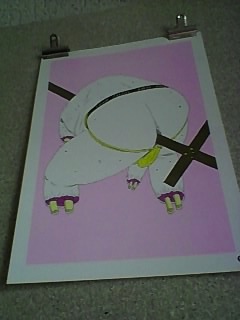
We first got taken to Salisbury House where we went to the Pick me up Exhibition. There was loads gong on and it was really inspiring. I saw some really cool examples of half tone in use, which was encouraging, although I remain daunted by the execution. The first image is of a book called 'Ada' by
Gertrude Stein. (Stein, 2010) It's not really my thing (silly or disgusting aswell as visually exciting) so I didn't pick up a copy but I did admire the technique and use of colour.


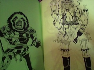
I also saw some work I reeeeeally like by an artist I’d somehow not been acquainted with before! James Unsworth’s work is seriously fucking disgusting. Hence why I enjoy it. He had some prints and a book for sale there, 'Ninja Turtle Sex Museum' (Unsworth, 2010) that was very unfortunately sold out! But I shall make sure I get my grubby mits on it if I can! Also, his website (that I’ve linked above) although extremely simple, I really like. Anyway, the book is a basically just a load of really cool drawings of really gross stuff, the main themes being sex and teenage mutant ninja turtles, and ya can’t argue with that.


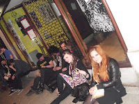
There's a print shop below the gallery we’re having our degree show in on Brick Lane, and they were there doing live prints there which was cool. There were artists downstairs doing live illustrations and selling them and there was a room where you could make stuff yourself. There were also a couple of instillations where a show was going to be acted out, and one that involved audience participation, which was interesting. It was nice to visit a creative space that was so interactive. Here’s some pictures of some of that.


Those green ones at the end are pictures from another book wot I liked. Anyway, after that some of us took a trip to Brick Lane for bagels, and so that the others could check out the gallery space I booked us. There was an exhibition on at the time and I think it was really good to see the space in use to give us some inspiration and to see how much is possible. The show title was strung up in the window, there were large 3D objects and music playing. I think we may need some boards across the middle of the space in order to fit all our work in though. This is the only picture I got on my crappy mobile that isn’t totally fuzzy but here’s Pierce’s head and the gallery… but mainly Pierce’s head.


Our last port of call was Atlantis Art, which was brill. It was huge and cheap. The Bristol board was a whole £2 cheaper than Southamptons one art shop! Stoopid Perrys!! The portfolios were also a lot cheaper than at Cowling and Wilcox AND they had zips and handles! I could have got one of the same size as mine for a bit less, that would be easier to carry and also rainproof! But I suppose mine does look nicer... and it’s brown. Yeaaah… That’s what it’s all about. Oh, and here’s a nice bit of graff we saw too.


I was also hoping to go to this museum in Holborn, which is meant to be like somebodys house- and he has a load of human remains there? It sounds creepy anyway. I know where it is now though so I’ll check that out another time
.
Friday I finally finished my screen print! My acetates had stuck together and some of the ink had gone from one to the other but it wasn’t that bad and I quite like imperfections so I persisted. Jonny helped me re-learn the practice and I really enjoyed it! I’m generally quite haphazard and spontaneous with my approach and don’t know if it really suits me as a process but it’s definitely something I regret not having another razz at before now. It’s nice to hand make a series of images in that way, which although are the same image all vary to an extent, and they just seem a bit special as a piece of work because of the process. And they feel nice. Not that you should really be all touching ‘em and stuff  …Get ‘em all grubby.

Anyway, I made and labelled 27 all together and a few of them I did on pink and black paper to see how they turned out. I also offset a few slightly and as I used fluorescent green with magenta pink they have an almost 3D look to them. I’m pleased with them and chose the best to go at the end of my portfolio. I thiiiink I may have sold one at the show too. That or my counting is appalling (which it is) so I’m not holding my breath or anything.
Also this week I have amended my cover image and I think it looks a lot better. I think the problem was the proportions, and I’ll be adding the smoke afterwards.
I’ve also finished that Webcomic I was talking about ages ago so that’s a weight off. What was I thinking taking that on as well as all the fundraising and London show business!? It’s certainly not my finest work but here it is if ya fancy a peek. It's about bullying it is.


Anyway, I’m hungry so I’m going to see what I can slap together out of whatever lies rotting in my cupboards. Next week we have our identity workshop during which we will be finalizing our wall for the catalogue image, so I’ll be preparing something for that in the week. Other than that the focus is solely on the FMP, perhaps taking some time to polish some portfolio bound images too.

Thanks for stopping by…
Quim out

Thursday 24 March 2011

16. I know it's not like me to be late but...

Greetings loyal blog visitor! This is a post I typed up Sunday but only just got 'round to Posting all with pretty pictures and whatnot.
Anyways, hold on to yer hats and hairpieces folks ‘cause I’m gonna shake things up a bit this week and talk about the progress of my project first. At the end of last week I decided to stop puzzling over my media and steam through my layouts, which I have now done. Here’s a little picture of what that looks like: (...Apparently blogspot has decided that my image shall reside to the left of this paragraph rather than below it)

      There are 20 pages in this book of Bristol board, which is conveniently the exact amount I needed. I then proceeded with my cover, which I planned out on these lowly scraps of cartridge paper a number of times first. Naturally though I still managed to screw it up so I’ll be getting some more Bristol board to rectify that. This is the cover I did below, one of the reasons I don’t like it is because for some reason I decided I’d outline the smoke? Which looks really odd. The other reasons I can’t really put my finger on but I’m gonna take this one ‘back to the drawing board’ so to speak. I thought maybe it just needs colouring to look good, but surely if an image needs that it can’t be very strong to begin with.


      On the Tuesday of this week I had a tutorial with Jonny, he told me which colouring method he likes best but I’m still undecided… Most people and tutors have advised I do use half-tone, and I can’t help but feel reluctant for some reason. I think it’s probably just because I’m not very comfortable with it, and think it may prove very time consuming, especially given the time frame I now have. He also looked at my possible catalogue images and we both agreed that I should use a spread from my last book for one of the pages. I don’t think he was blown away by any of my other images though, but I decided I’d just pick which I think represents me best. I later chose these two images and prepared them in line with the specified requirements:


Also on Thursday this week we had bookbinding workshop, which I’d completely forgotten about! I’d been really looking forward to it too so I was pleased to have that, although I had said I’d help on the art stall that day! There were plenty of people helping out though so it was okay.  Bookbinding was really fun and useful and we made 8 different kinds of book! I found some books would be more useful than others and to my surprise (as I am quite clumsy) I found it quite easy to do too. Well, to a point. I did struggle a little with the hardback book and although I managed mine was rather wonky. A brilliant skill to possess though and I intend to keep in practice.


In our break from bookbinding, I popped down to the art sale to see how it was going, I brought a rather elaborate human sandwich board in the shape of Zain, I’m not sure if he encouraged customers or frightened them though. The stall looked great and I bought a couple of little wicked little books made by fellow students (and managed to put away a couple of rather tasy cakes). but by lunchtime we’d only made about £20, it really picked up though and by the end of the day we’d made over £100 for the degree show!


On Friday we had a lecture with Graham Rawle, which was really good. I enjoyed his ‘lost consonants’ work and also his 'Niff actuals' which are basically just useless products, I thought it was really funny and quirky! The rest of his work was quite different and very literature based but as I am interested in narrative and storytelling it was really interesting to see such an original approach to illustrative storytelling. Here's his website. After the lecture I had arranged a meeting regarding the London show. The turn out was pretty good this time and I basically just wanted to push the importance of fundraising, as we need about £2500 yet! Hopefully everybody now understands that everybody needs to put on nights and chip in else realistically it just won’t happen. There are now three or four groups of people planning nights or sales so hopefully we’ll get there. Talking of night’s mines coming up, so I’ve been busy postering!

After that, I finally managed to get in the print room and Charles was very kind to take some time to re-teach me how to screen print. It was late in the day so I managed to prepare my image but I need to return next week to actually print it. I took my image, which I had printed in A3 and I then took two sheets of A3 acetate and chose which bits I wanted in each colour. After drawing these out in ink (and waiting for them to dry, which took AGES! Next time I’ll use a bloody marker pen) Charles took me to the photocopier. He showed me how to create a sort of two-colour mock up in order to see what colours I would like. This was reeeally beneficial ‘cause after printing it out I saw all the flaws and was able to rectify them before actually printing it. Charles then kindly prepared me a screen and instructed me to return at 10am Monday. I realised yesterday though that I have work in progress Monday morning and a London trip Tuesday so hopefully it will be okay to do it Wednesday. Here’s some pictures of my acetates and mock ups anyway, I’ll probably use this image as the last page in my portfolio if it comes up well.


      Anyway I think that’s it! As I’ve mentioned I have a WIP with Pete Monday, and London trip Tuesday. We’re going to an exhibition called, ‘Pick me up’ at Somerset house, which should be good. I also need to complete my scree print and really get on my final images for the project. Also it’s the fundraiser next Saturday!! So got a bit more to do regarding that.

Thanks again for reading,
Quim out!

Tuesday 15 March 2011

15. CV.

I've worked on my CV and here it is now, gretly improved I'll say!


Kimberley Hawkes
22.07.89
7 ringcroft street, london, n78nd
Phone 07525327114 • kimberleyhawkes@hotmail.co.uk
personal statement

I consider myself to be a reliable, hard-working and dedicated individual who enjoys challenges, learning new things, taking on responsibilities and working hard in a team or on my own to get a job done to the best of my ability. I am a polite and well-spoken, open-minded and friendly person who loves to meet new people and will always do my utmost to help others. I also greatly enjoy working under pressure and I feel that I have a lot to offer after having attained a lot of experience and confidence during my last jobs in customer service.
Education

2008 - 2011        Southampton Solent University                                         
BA Hons Degree -
n  Illustration
2005 - 2007        Fareham College
BTEC National Diploma – Triple Distinction
n  Art & Design
A Level – A Grade
n  Photography
NCFE
n  Life Drawing
2000 - 2005        Southampton Solent University                                         
GCSE (A-C)
n  English (Plus English Lit & Media Studies), Religious Education (Long and short course), Art & Design, Resistant Materials, Maths, Science.

Work Experience


2009 - 2010        ASDA                                                        Southampton
Checkout Operator – Part Time
n  Operating checkouts, putting out stock.
2009                 HOMEBASE DIY                                             Milbrook
Customer Service Assistant – Part Time
n  Job role as described below in previous job. I also had the responsibility of handling cash and issuing change.
2007 - 2009        FOCUS DIY                                                     Fareham
Customer Service Assistant – Full & Part Time
My job was to run the information and customer service desk. This involved operating tills, issuing refunds, dealing with customer complaints, answering questions, finding stock, using the speaker system, answering the phone, processing and logging customer orders, issuing discount cards and hiring out in store concessions. I also gained some experience in the stock office and on the shop floor which involved counting and pricing stock, printing collection notes, setting up displays, facing up and putting out stock.
2005 - 2006        HOLIDAY INN HOTEL                                    Fareham
Food and Beverage Assistant – Part Time
Responsibilities included preparing the function room, cleaning and setting tables and coffee stations, serving food and drinks, clearing tables, removing used cutlery, condiments, glasses and rubbish and the polishing cutlery.

hobbies & interests


My passion is illustration, I also enjoy going to see live music and visiting the cinema. I also enjoy cooking, reading, travelling abroad and spending time with friends and family.

References


References and letters of recommendation available on request.


and not a willy in sight!
Quim out!

Monday 14 March 2011

14. Running outta titles!


 Right, you should know the drill by now! Last week I had another portfolio tutorial with Louise and it went really well, we discussed what ones out of the images I’d chosen so far should go where and talked about my ideas for the general flow of it. She also gave me an idea of what other images should go in and Chris Arran while passing also took an interest in my work and some time to help us out which was really nice and it’s always good to have more than one opinion. She also explained what images could be improved and how, I think I will take some time to colour my line work and she also encouraged me to get in the print room for one of my images. This is something I’ve been reluctant to have a another go at since I wasn’t terribly good at it in first year, and where it’s a bit initially complicated and fiddly I guess my attention span failed me. I’ll need to literally re-learn everything but I’m quite eager to get in there now so I’m planning to do that next week.

     Also this week we had a CV Workshop with Alexandra. Unfortunately we weren’t told we would need to bring our CV’s. In a way it was probably a bit obvious and I could have done just in case, but I assumed we’d be seeing examples, taking notes, etc. It was more like a crit and advice of our existing ones. A lot of people made the same assumption as me though as only two or three people had theirs.  It was useful to see some though and I took some notes, we also saw some examples that Alexandra had been sent including some really elaborate ones, which were really cool. We then used the rest of the time to share our blogs and discuss how the were going. This was alright, it’s always good to know how to improve and to see what others are up to, but maybe we’d benefit more from one to ones ‘cause that’d also be a bit of a timesaver when we’ve got so much else on!  She did suggest that though so hopefully next time. Either way I’m planning on getting my CV together a bit before then, judging by what I’ve seen it’s a bit of a nightmare at the minute!


     I went down to Brick Lane this weekend with these rascals as I’ve been corresponding with Andreja from East Gallery, who gave me the awesome news that we can hire it for a week in early July for £1200! Which is the same as the Gallery near Goodge Street but a much nicer space and in a much better location. I did discover that it would be nearly £250 more for gallery staff but I think as they will also promote us on their website, put us on their mailing list AND as our private view is on the first Thursday of the month we’ll even have exposure from Time Out’s ‘First Thursdays’ which you can check out here. Well stoked about that! So I paid the deposit (which was 30% of the total). It’s so busy down there with the market on, there were people having a gander at the current exhibition, which is really encouraging. Going back to the issue of gallery staff, I know I’ll be moving to London in July and I know there will be other students moving there/back there, so perhaps if a few of us were happy to take a day or two out of frantically searching for a job, we could even staff it ourselves. Great experience and a decent thing to have on a CV! I don’t think they handle sales either, so it would be a better way to make money. There’s still a lot to organize but everybody’s getting really enthusiastic which is awesome, I think I’ll plan a meeting next week to discuss raising some more money, cause there’s definitely a lot to do on that front! Talking of which, my next ones coming up and the posters now finished!  Second year Dan Murphy did it for us and I’ll be getting it printed up nicely this week and sticking it all about town. Here is it!


       Also, while I was down Brick Lane I saw some cool David Shrigley stuff in Rough Trade Records. There was his book, ‘What the hell are you doing?’ (Shrigley, 2010) which I’m definitely going to have to get my hands on online! I like Shrigley's work because his drawings are very simple and childlike and his commentry is funny, and above all pretty silly. By the till there were packs of badges and guitar picks illustrated/written on by him. Guitar picks by artists is a less common one and I thought it was a nice idea. He had even signed the wall, along with other famous people like The Slits! Groooooovy. Here they are anyway, the book next to it was pretty cool too, but unfortunately too expensive for me today! It's called Bukowski on Bukowski, (Bukowski, 1998) and I really liked some of the drawings.


  I’ve been doing some sketches from the 50’s sourcebook I got from the library, whilst listening to the awesome CD Jonny made me. As proposed in my last entry I did a mock up page and coloured it in both pencil and half-tone. As expected I STILL couldn’t decide what approach to use. After seeking advice from other students/tutors I ended up trying a mixture of both. I did one with foreground/background in opposing finishes and also block Photoshop colour opposing half-tone on background and foreground. I’ll post them below, I have ones, which I prefer- I didn’t really like the block colour ones. Even so I’ve still not decided! I think I should definitely move on and steam through my layouts this week and come back to it (and I’ll do the pencil swatches I mentioned if I do decide to use that approach, also I’ll have to invest in some more decent pencils). I have some nice paper for my layouts now too, no more bleeding ink!
 

and here’s a little summary of what I’ve gotta get through next week:

Ø  Layouts for FMP
Ø  Screen printing and more progress on Portfolio
Ø  Update this bad boy again
Ø  Upload more pictures and edit my website
Ø  Slightly unrelated, but I need to finish that webcomic
Ø  It’s time to choose and prep our catalogue images!
Ø  I also want to look in to getting some business cards printed, could be jumping the gun a bit though.
Ø  Work on my appalling CV
Ø  Promote my event, and arrange a meeting for the LDN Show geezers.

So quite a bit! Anyway I’ve gotta go ‘cause me trains nearly in and I’m off to a course representative meeting this afternoon, a good opportunity to give some feedback on the course and I hear there may be some feeding involved… heh heh.

Laters potaters,
Quim out!